page and pages#
A scene can lay its panels out on pages. pages: is a list of pages; each page is a list of
tiers, top to bottom; each tier is a list of panels, in reading order – left to
right, or right to left for a comic read that way. page: is the format they share.
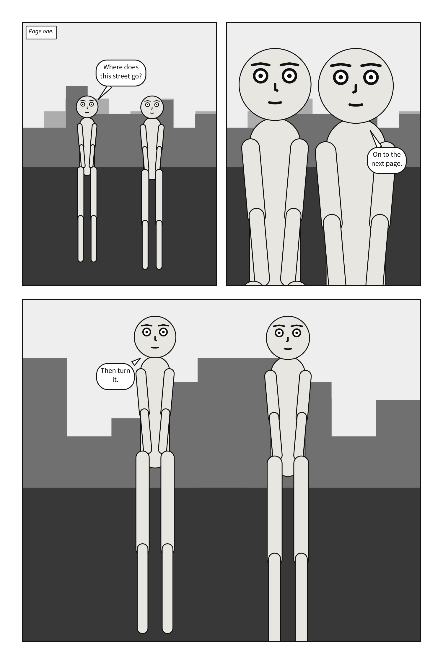
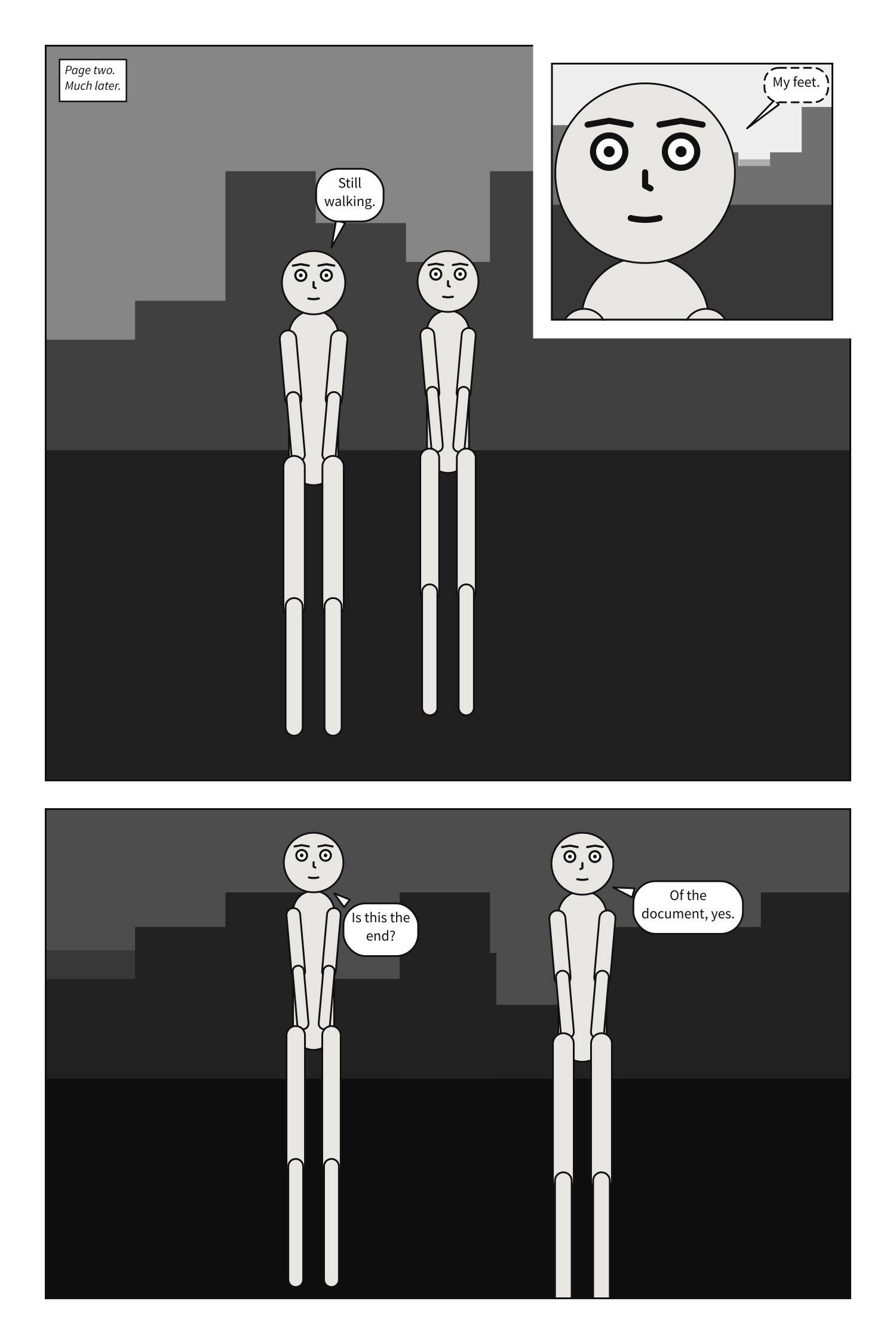
A comic script’s pages are its PAGE headings instead; its front matter takes page: but not
pages:. See Write a panel as a comic script.
Shares work like CSS Grid’s fr tracks: what the margin and gutters leave is
divided in proportion to the weights. A splash page is one tier holding one panel.
A panel on a page is compiled at its frame’s size, exactly as it would be compiled alone at
that size: the page decides how big the frame is and nothing about what goes in it. The one other
thing it decides is type size. Alone, a panel letters at a fixed fraction of its own height; on
a page every panel letters at the same size, as if each were one tier of a three-tier page, because
no letterer sets a short panel and a tall one at different sizes. A size you set with
lettering takes its place.
A page is read tier by tier, left to right, and down each column, so the order panels are written
in is the order they are read in; that holds by construction. A panel can be on one page once. A
panel on no page is allowed, and compiles as it always did; it may exist only to be inherited from
with over:. Everything a page cannot lay out is page-layout, naming what and where.
Not yet: frames of any other shape, such as round panels or ones without borders.
page#
The format every page shares: its size, margin, gutters and bleed.
Where |
A |
Type |
a mapping |
Default |
each key’s own |
Since |
0.10 |
Diagnostics |
The format is the document’s: written once beside panels:, it is every page’s. It is not a
panel’s default, so a panel under panels: does not write it.
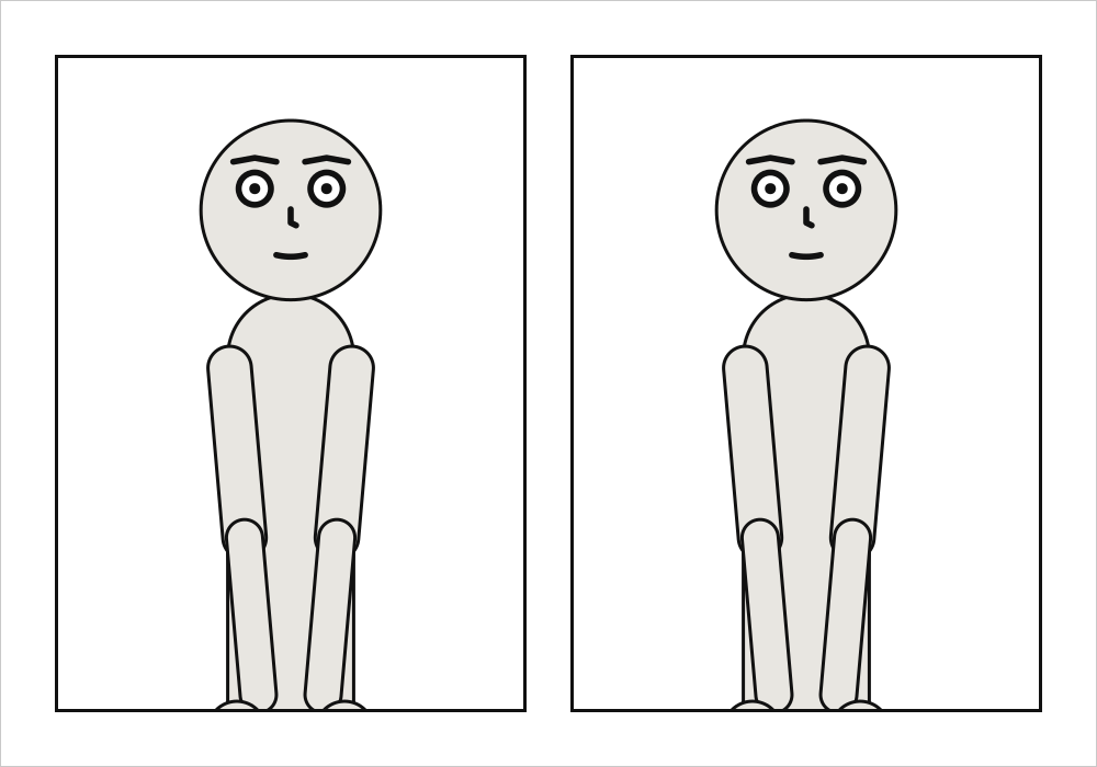
page: {size: [1000, 700], margin: 50}
cast: {alice: {reference: alice}}
panels: {one: {}, two: {}}
pages:
  - tiers:
      - panels: [one, two]
See also: pages, Compose a page.
page.size#
The page’s width and height: the trim, the size the printed page is cut to, in the units a panel uses. Printed, a unit is a tenth of a millimetre.
Where |
A |
Type |
|
Default |
|
Since |
0.10 |
Diagnostics |
|
In the gallery |
Printed, a unit is a tenth of a millimetre. The default page prints at 200 × 300 mm; a US
comic’s 6.625 × 10.25 inches is size: [1682.75, 2603.5], and a tankōbon’s B6 is
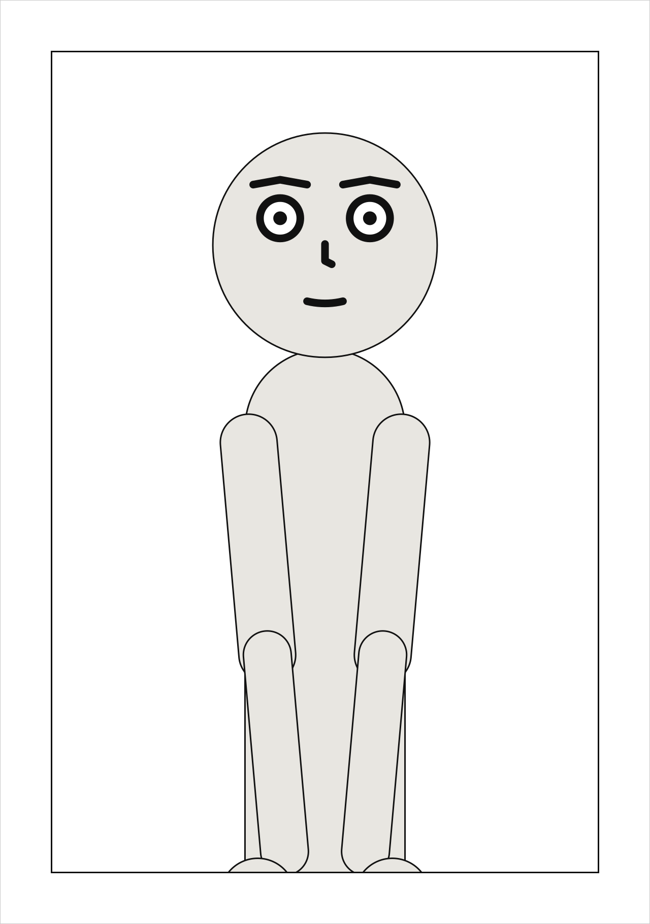
size: [1280, 1820]. It is the trim: the size the printed page is cut to. The SVG page is drawn at
its trim.
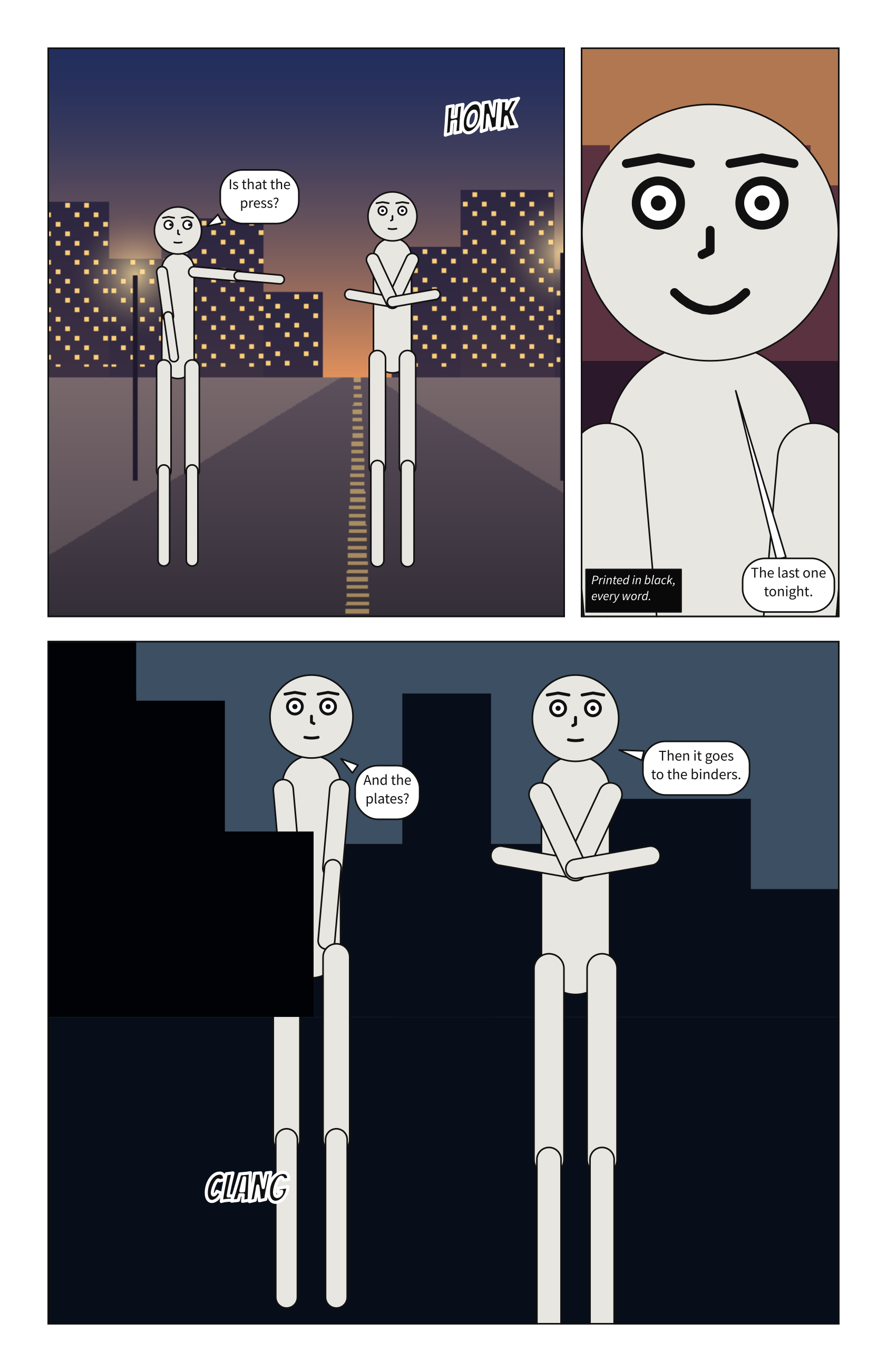
page: {size: [1280, 1820]}
cast: {alice: {reference: alice}}
panels: {splash: {}}
pages:
  - tiers:
      - panels: [splash]
See also: page.bleed, Print a comic.
page.margin#
The blank border inside the page’s edge, on all four sides.
Where |
A |
Type |
a number |
Values |
0 or more |
Default |
|
Since |
0.10 |
Diagnostics |
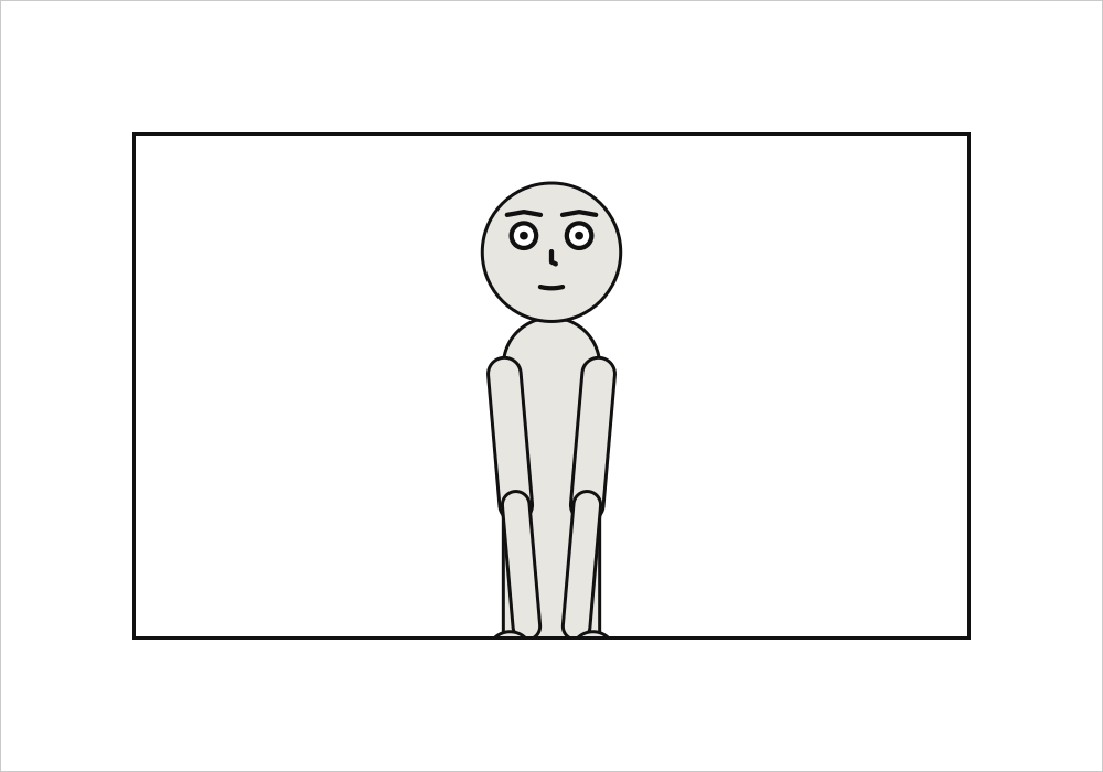
The blank border inside the page’s edge. Panels are laid out inside it, and it is the safe area for words: a panel that bleeds keeps its lettering inside it.
page: {size: [1000, 700], margin: 120}
cast: {alice: {reference: alice}}
panels: {one: {}}
pages:
  - tiers:
      - panels: [one]
See also: panel.margin, a panel’s own.
page.gutter#
The gap between two panels, or two columns, side by side in a tier.
Where |
A |
Type |
a number |
Values |
0 or more |
Default |
|
Since |
0.10 |
Diagnostics |
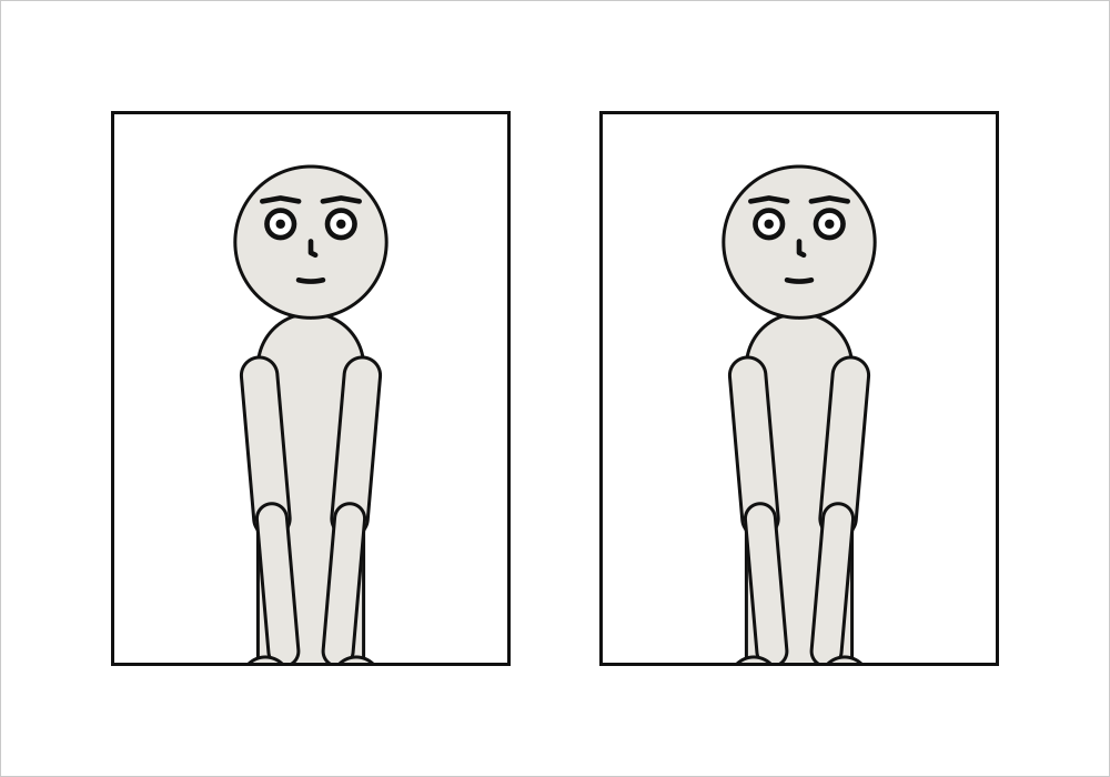
The gap between two panels side by side, or between two columns. An inset sits a gutter in from its corner, ringed by a gutter’s width of white, and a slanted gutter stays a gutter wide measured across the cut.
page: {size: [1000, 700], gutter: 80}
cast: {alice: {reference: alice}}
panels: {one: {}, two: {}}
pages:
  - tiers:
      - panels: [one, two]
See also: page.tier_gutter.
page.tier_gutter#
The gap between two tiers, and between two panels stacked in a column. Wider than gutter, as in print, so a tier reads as one row.
Where |
A |
Type |
a number |
Values |
0 or more |
Default |
|
Since |
0.10 |
Diagnostics |
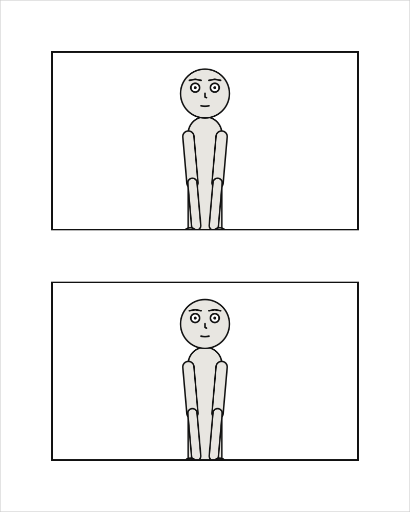
The gap between two tiers, and between two panels stacked in a column. Wider than gutter by
default, as it usually is in print: a narrower gap within a tier binds its panels into one row,
which is the direction they are read in.
page: {size: [800, 1000], tier_gutter: 100}
cast: {alice: {reference: alice}}
panels: {top: {}, bottom: {}}
pages:
  - tiers:
      - panels: [top]
      - panels: [bottom]
See also: page.gutter.
page.bleed#
How far the printed sheet runs past the trim on every side, so art that reaches the edge can be cut cleanly: 30 is 3 mm. Paper around the page; nothing on it moves.
Where |
A |
Type |
a number |
Values |
0 or more |
Default |
|
Since |
0.13 |
Diagnostics |
bleed is in the units of the page: 30 is 3 mm, 31.75 is the 0.125 in US printers ask for. It
is paper around the page and moves nothing on it: the PDF’s TrimBox is the page, its BleedBox the
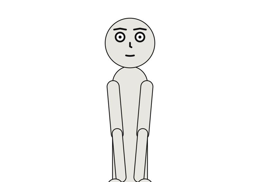
page grown by bleed on every side. A page needs a bleed of its own for its panels to
bleed into; with bleed: 0, they stop at the trim, and print says so.
page: {size: [1000, 700], margin: 60, bleed: 30}
cast: {alice: {reference: alice}}
panels: {wide: {}}
pages:
  - tiers:
      - panels: [{use: wide, bleed: true}]
See also: panels[].bleed, Print a comic.
pages#
The pages, in order, each a list of tiers top to bottom.
Where |
A |
Type |
a list of mappings |
Default |
none |
Since |
0.10 |
Diagnostics |
|
In the gallery |
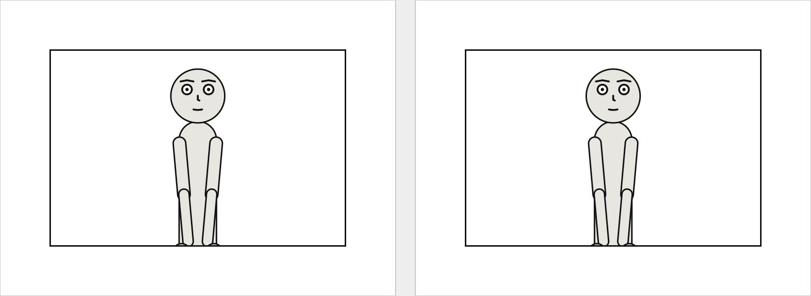
The pages, in order. A document of several pages is drawn as a spread, side by side – from the right in a comic read right to left – and each page is a page of the print PDF.
A panel’s name, its key under panels:, is text, as a cast member’s id is. YAML reads an unquoted
1: as a number, so a panel named by its number is written '1':. A placement naming a panel
panels: does not define, or a panel placed twice, is page-layout.
page: {size: [800, 600]}
cast: {alice: {reference: alice}}
panels: {first: {}, second: {}}
pages:
  - tiers:
      - panels: [first]
  - tiers:
      - panels: [second]
See also: panels, Compose a page.
pages[].tiers#
The page’s tiers, top to bottom.
Where |
A |
Type |
a list of mappings |
Default |
none |
Since |
0.10 |
Diagnostics |
|
In the gallery |
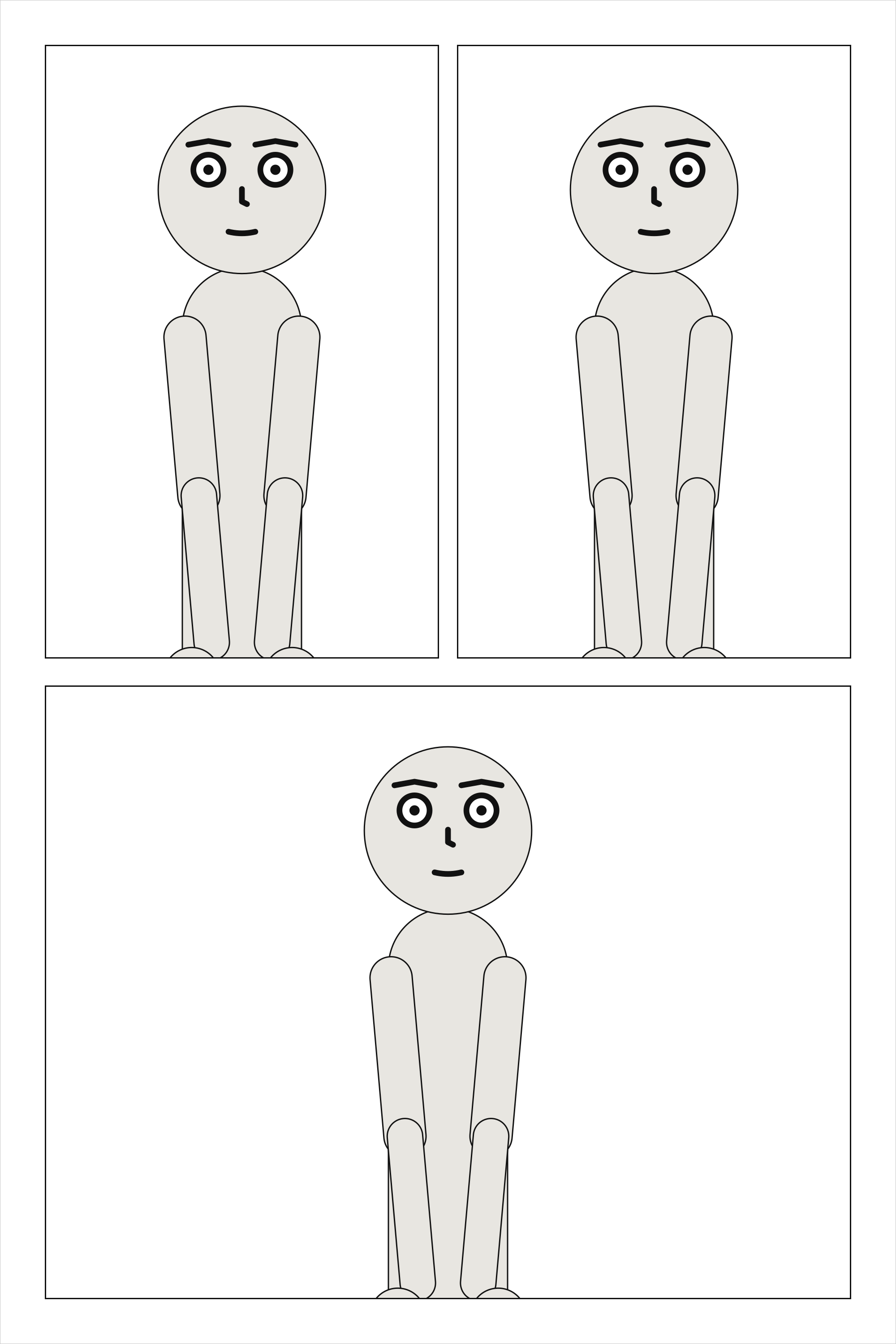
The tiers of one page, top to bottom; a page has at least one. Margins and tier gutters that leave
no height for the tiers are page-layout.
cast: {alice: {reference: alice}}
panels: {a: {}, b: {}, c: {}}
pages:
  - tiers:
      - panels: [a, b]
      - panels: [c]
See also: tiers[].height.
tiers[].height#
The tier’s share of the page’s height, relative to the other tiers.
Where |
A |
Type |
a number |
Values |
above 0 |
Default |
|
Since |
0.10 |
Diagnostics |
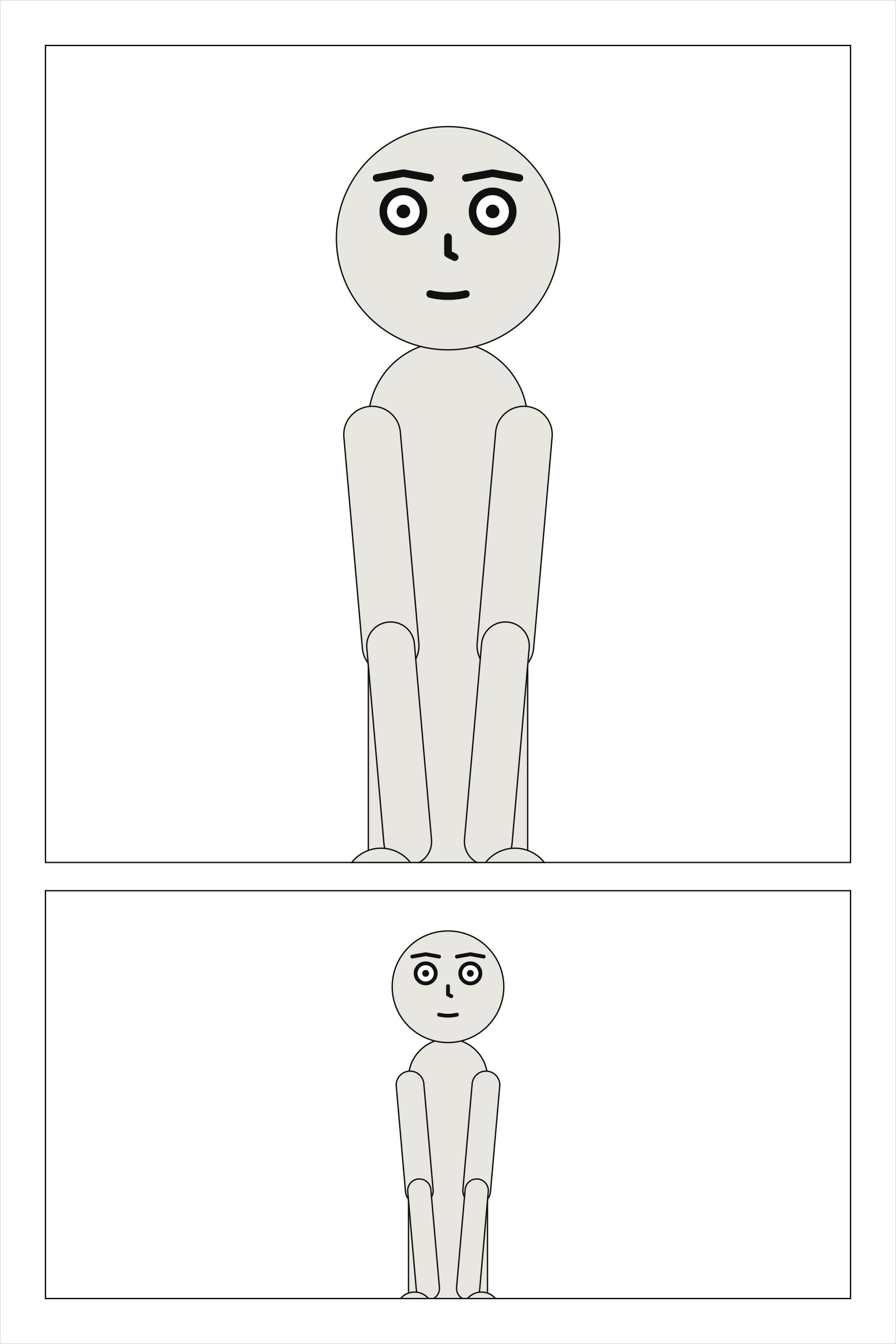
A tier’s share of the page’s height: two tiers of height: 2 and 1 take two thirds and one
third of what the margins and tier gutters leave.
cast: {alice: {reference: alice}}
panels: {tall: {}, short: {}}
pages:
  - tiers:
      - {height: 2, panels: [tall]}
      - panels: [short]
See also: panels[].width.
tiers[].panels#
The panels in the tier, in reading order: left to right, or right to left for a comic read that way.
Where |
A |
Type |
a list, each text or a mapping |
Default |
none |
Since |
0.10 |
Diagnostics |
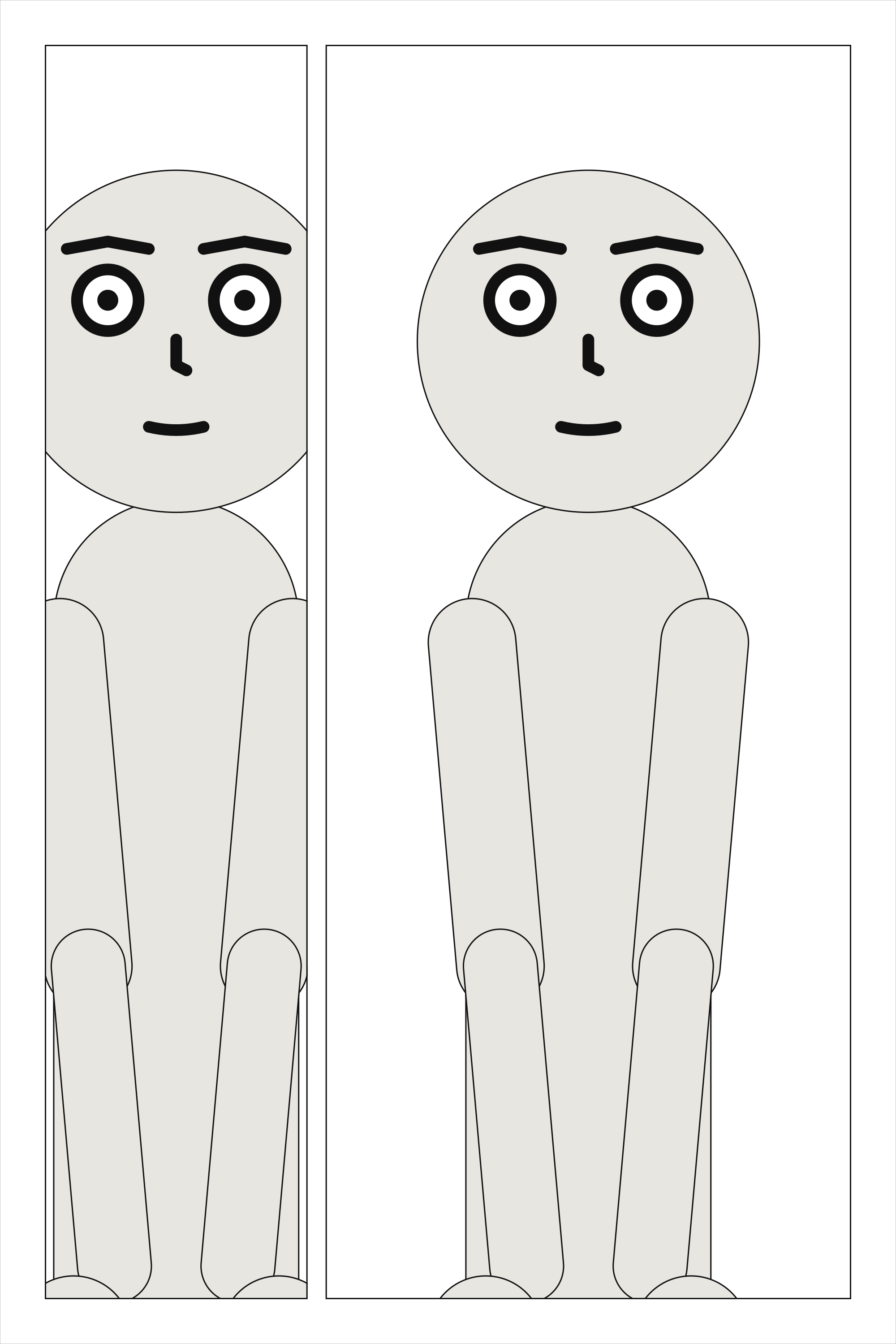
The panels of a tier, in reading order: left to right, or right to left for a comic read that way.
Each is a panel’s name, or a mapping that names it with use and gives it a share, insets or a
bleed. A tier holds panels or columns, never both and never neither.
cast: {alice: {reference: alice}}
panels: {one: {}, two: {}}
pages:
  - tiers:
      - panels: [one, {use: two, width: 2}]
See also: tiers[].columns.
tiers[].columns#
In place of panels: columns side by side, each a stack of panels read top to bottom before the next.
Where |
A |
Type |
a list of mappings |
Default |
none |
Since |
0.10 |
Diagnostics |
|
In the gallery |
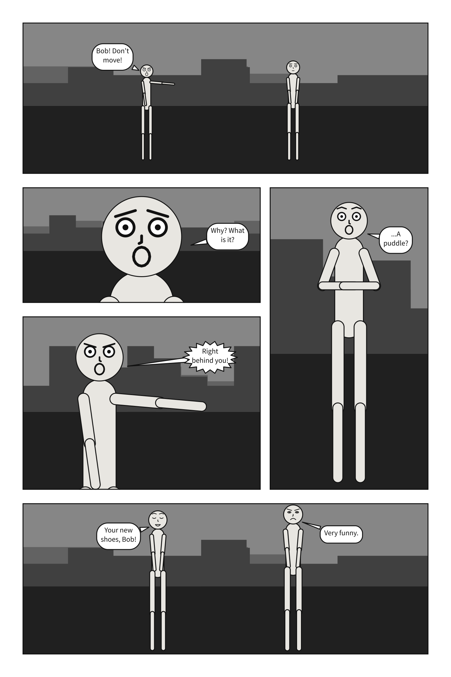
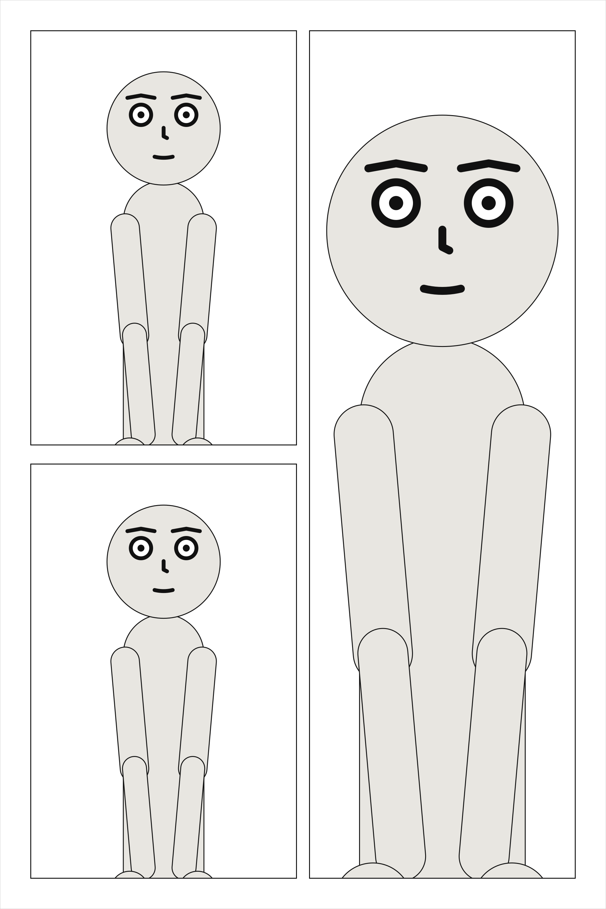
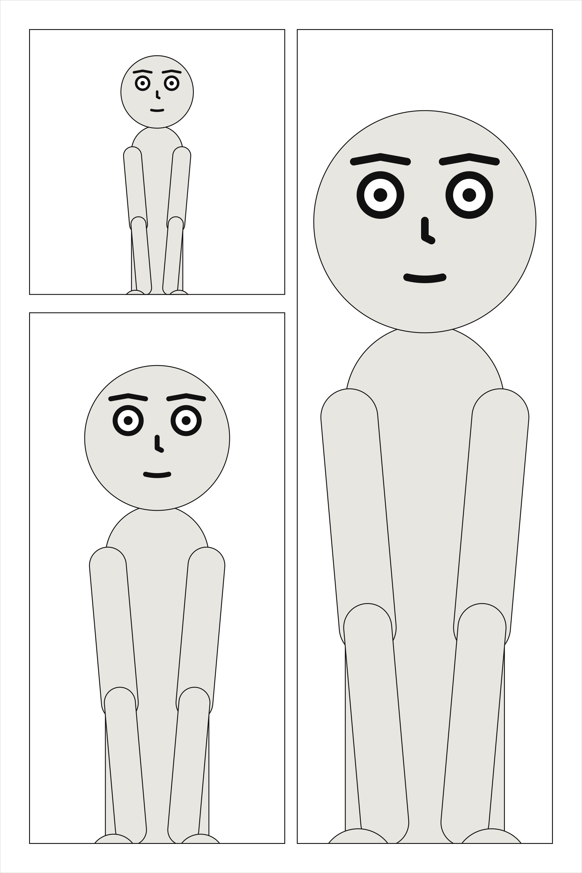
Columns are how a tall panel beside a stack of short ones is written: the tier is split across
into columns, and each column down into its panels, with tier_gutter between them. A tier of
columns is read column by column and top to bottom in each. That is the order readers take when a
panel spanning the tier blocks the way across (about nine in ten of them, in Cohn’s 2013
experiments). Two stacks side by side have nothing between them blocking the way, and readers go
across those instead, so they are refused as page-layout; write them as tiers, or put a panel
that spans the tier between them.
cast: {alice: {reference: alice}}
panels: {above: {}, below: {}, falling: {}}
pages:
  - tiers:
      - columns:
          - {panels: [above, below]}
          - {panels: [falling]}
See also: columns[].width, A tall panel beside a stack.
tiers[].slant#
How far the gutters between the tier’s panels lean, in degrees, from -30 to 30. Positive leans the top of each gutter to the right.
Where |
A |
Type |
a number |
Values |
-30 to 30 |
Default |
|
Since |
0.10 |
Diagnostics |
|
In the gallery |
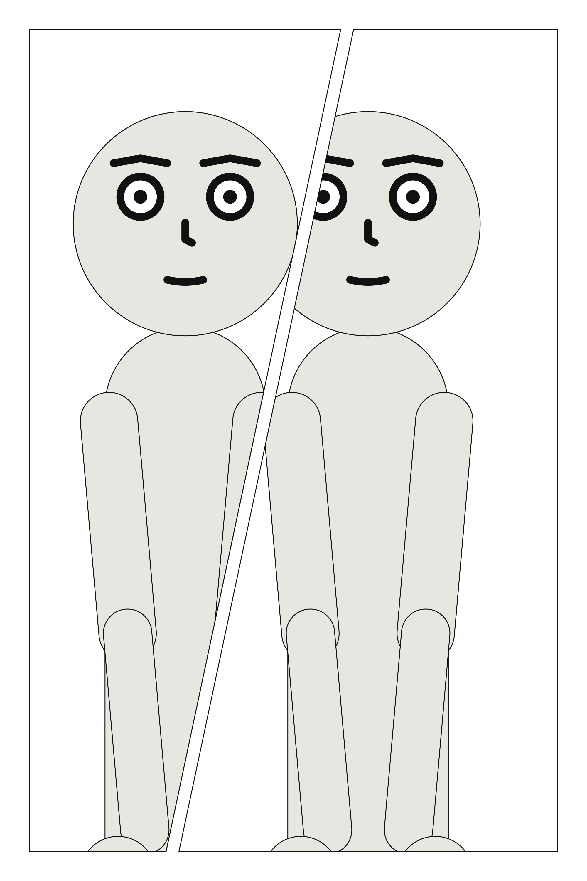
A tier of panels can slant, for a beat that should not sit square. Every gutter in the tier leans by that many degrees about its centre at the tier’s mid-height, so the weights share the width out exactly as they would upright, and neighbours share one cut. A gutter stays a gutter wide measured across the cut, and the tier’s outer edges stay upright. Each frame is then a four-sided shape, convex by construction.
A slanted panel is staged and framed in its bounding box, as a rectangle would be, and cropped to
its outline the way a margin crops; its lettering stays inside the outline. When the cut runs
through a character’s face, the compiler notes it. A slant needs gutters to lean, so a tier of
columns, a tier of one panel, and a slanted panel with insets are page-layout, as is a slant so
steep that a panel would have no width left at its top or bottom.
cast: {alice: {reference: alice}}
panels: {wind_up: {}, swing: {}}
pages:
  - tiers:
      - {slant: 12, panels: [wind_up, {use: swing, width: 1.3}]}
See also: A slanted tier.
panels[].use#
The name of a panel under panels:. Writing the name alone means {use: name}.
Where |
A |
Type |
text |
Default |
none |
Since |
0.10 |
Diagnostics |
The panel a placement puts on the page, by its name under panels:. Writing the name alone, one,
means {use: one}; the mapping is for a share, insets or a bleed. In a column, the same key names
a panel stacked in it.
cast: {alice: {reference: alice}}
panels: {one: {}}
pages:
  - tiers:
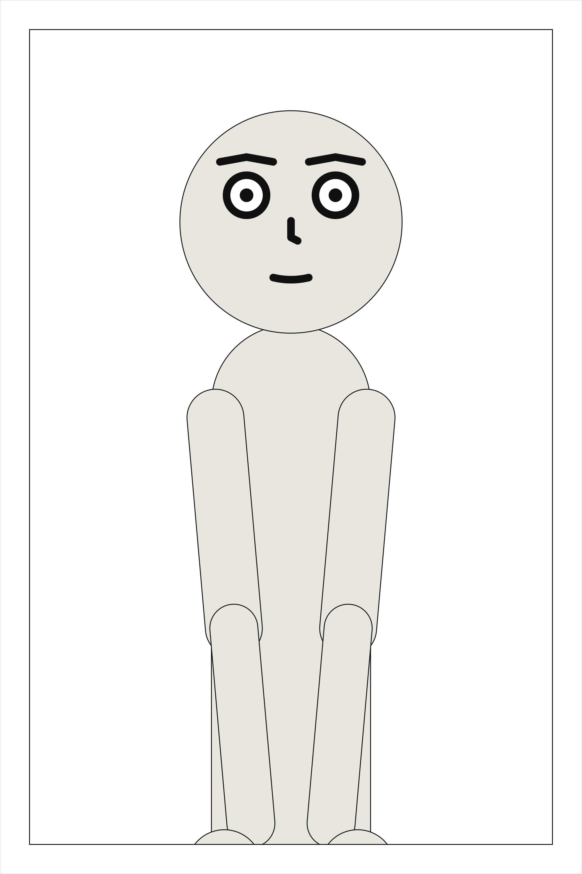
      - panels: [{use: one}]
See also: panels.
panels[].width#
The panel’s share of its tier’s width, relative to its neighbours.
Where |
A |
Type |
a number |
Values |
above 0 |
Default |
|
Since |
0.10 |
Diagnostics |
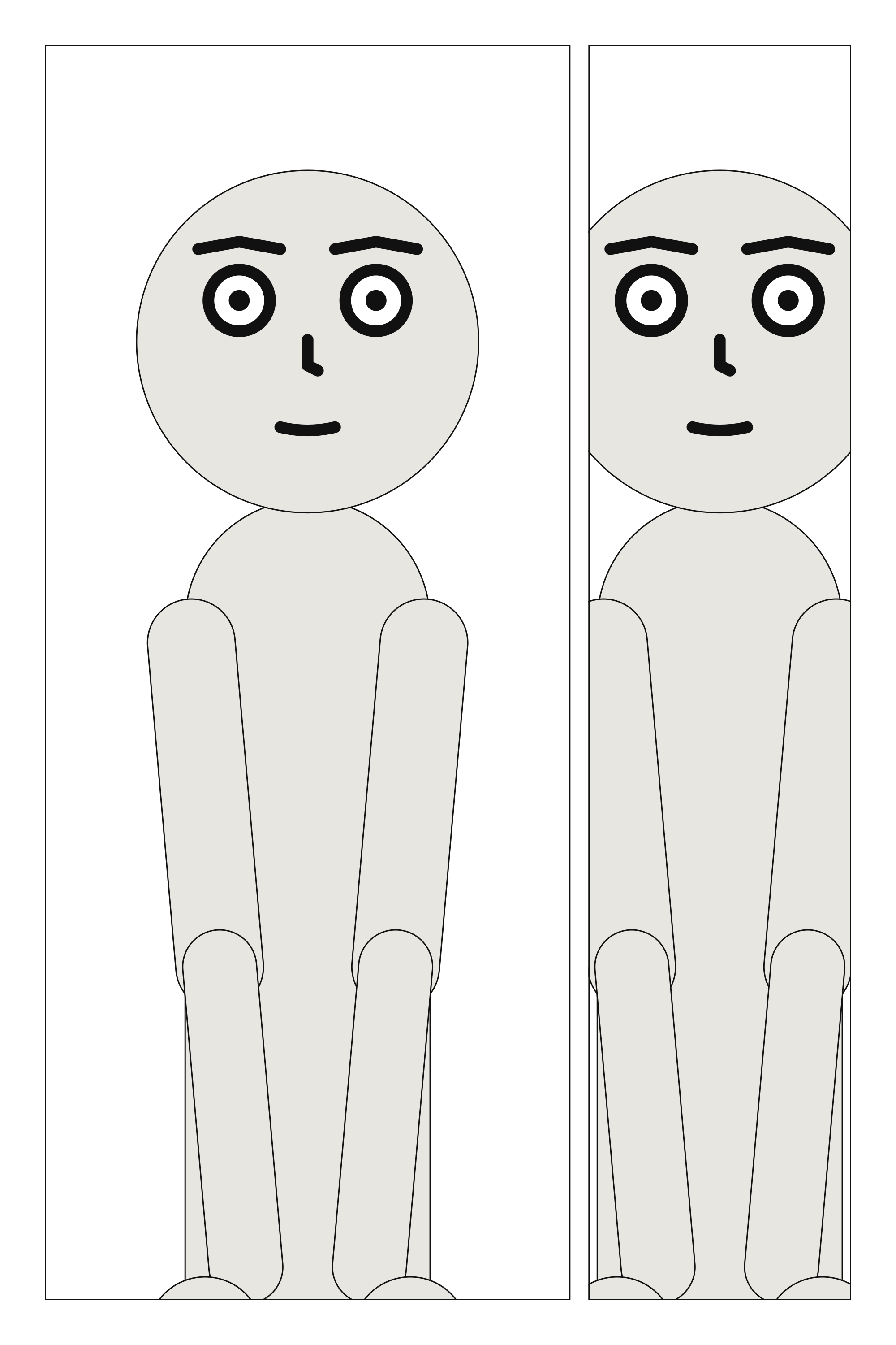
A panel’s share of its tier’s width, relative to its neighbours: width: 2 beside a panel of the
default 1 takes two thirds of what the gutters leave.
cast: {alice: {reference: alice}}
panels: {establishing: {}, reply: {}}
pages:
  - tiers:
      - panels: [{use: establishing, width: 2}, reply]
See also: tiers[].height.
panels[].bleed#
Run the frame past the trim to the bleed line, with no border there: true on every side that reaches the page’s margin, or a list of those sides.
Where |
A |
Type |
|
Values |
|
Default |
|
Since |
0.13 |
Diagnostics |
|
In the gallery |
A panel can bleed: its frame runs past the trim, out to the bleed line, and has no border on
that side, so its art goes to the edge of the cut page. bleed: true bleeds every side of the
frame that reaches the page’s margin; a list bleeds those sides only, and a listed side that does
not reach the margin is a page-layout error. The sides are the page’s, top, bottom, left
and right, whichever way it is read: the page is never mirrored. An inset sits inside its parent,
so it cannot bleed.
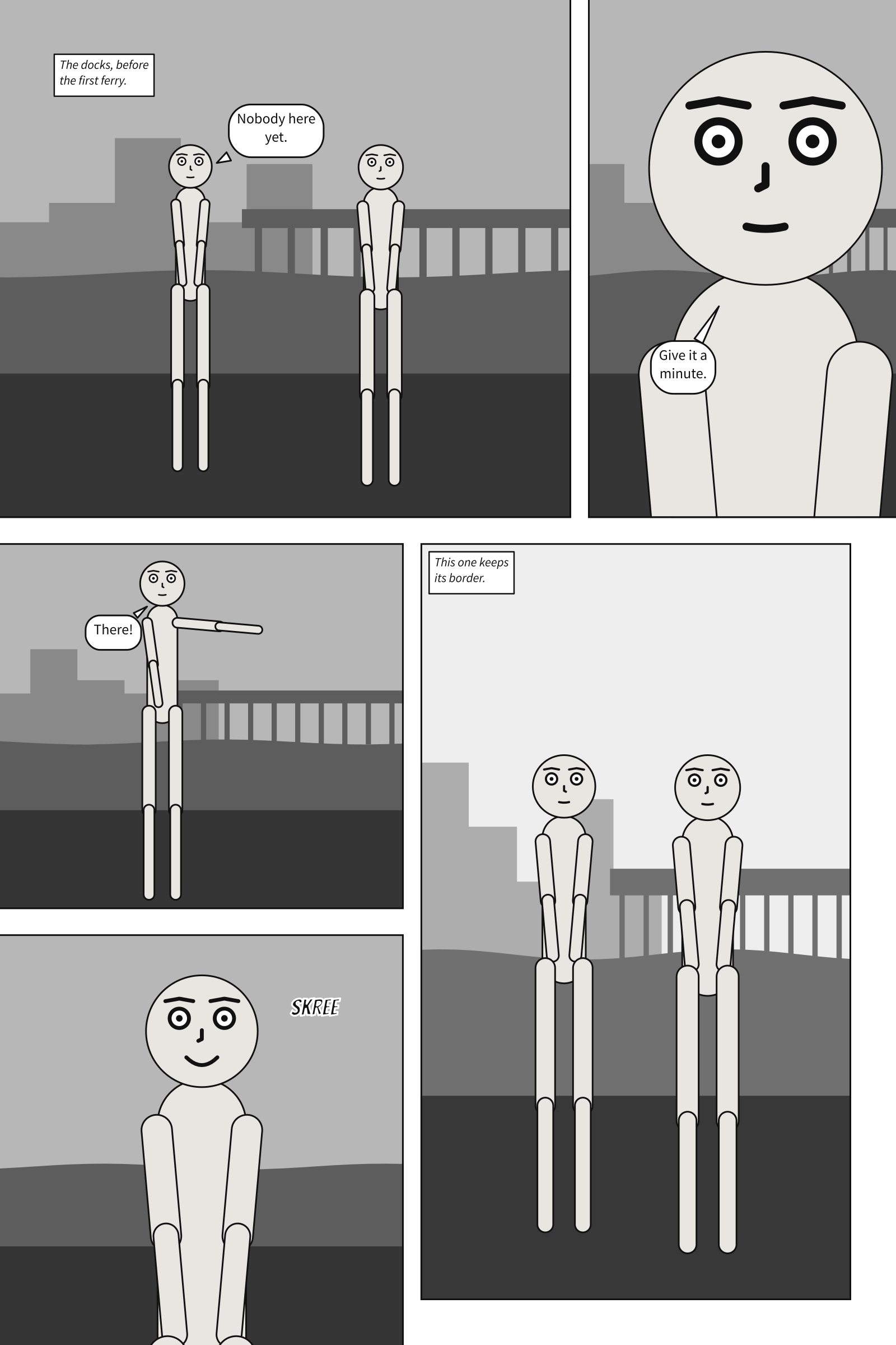
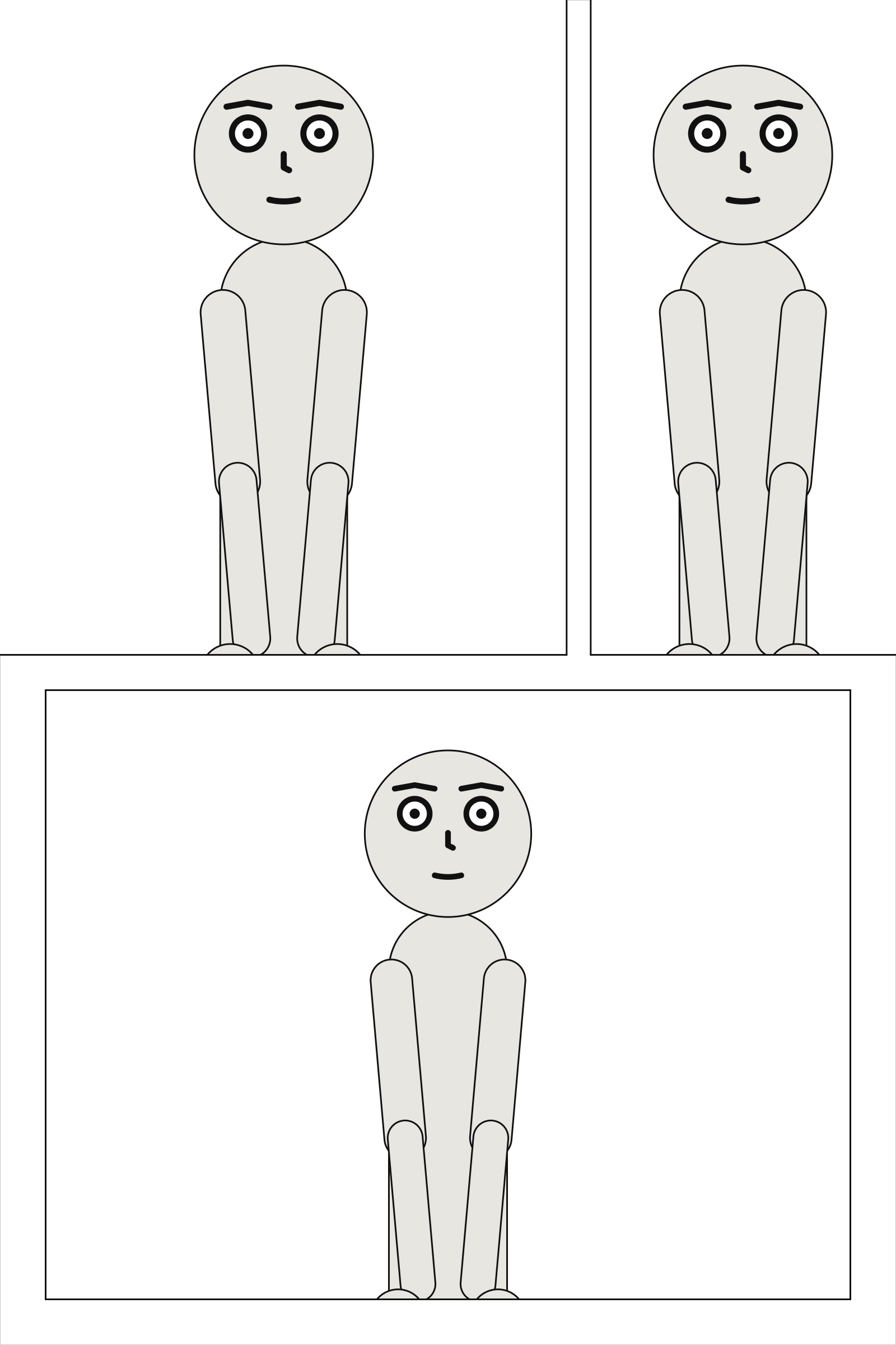
A bleeding panel is three boxes. Its frame runs to the bleed line: that is its size in its Core, and what its art, picture, veil and weather cover. What the reader sees stops at the trim, so its cast is staged and its camera framed in the frame out to the trim, and the trim never cuts a shot. Its lettering keeps inside the frame as it was before bleeding, inside the panel margin, so the page margin stays the safe area for words. Its insets stay where they were. The SVG page is drawn at its trim, as it will look once cut; its debug view shows the whole sheet, the trim and each bleeding panel’s lettering box.
page: {size: [1600, 2400], margin: 80, bleed: 30}
cast: {alice: {reference: alice}}
panels: {wide: {}, look: {}, far: {}}
pages:
  - tiers:
      - panels: [{use: wide, width: 2, bleed: [top, left]}, {use: look, bleed: true}]
      - panels: [far]
See also: page.bleed, the bleed itself.
panels[].insets#
Panels set into its corners, and drawn over it.
Where |
A |
Type |
a list of mappings |
Default |
none |
Since |
0.10 |
Diagnostics |
|
In the gallery |
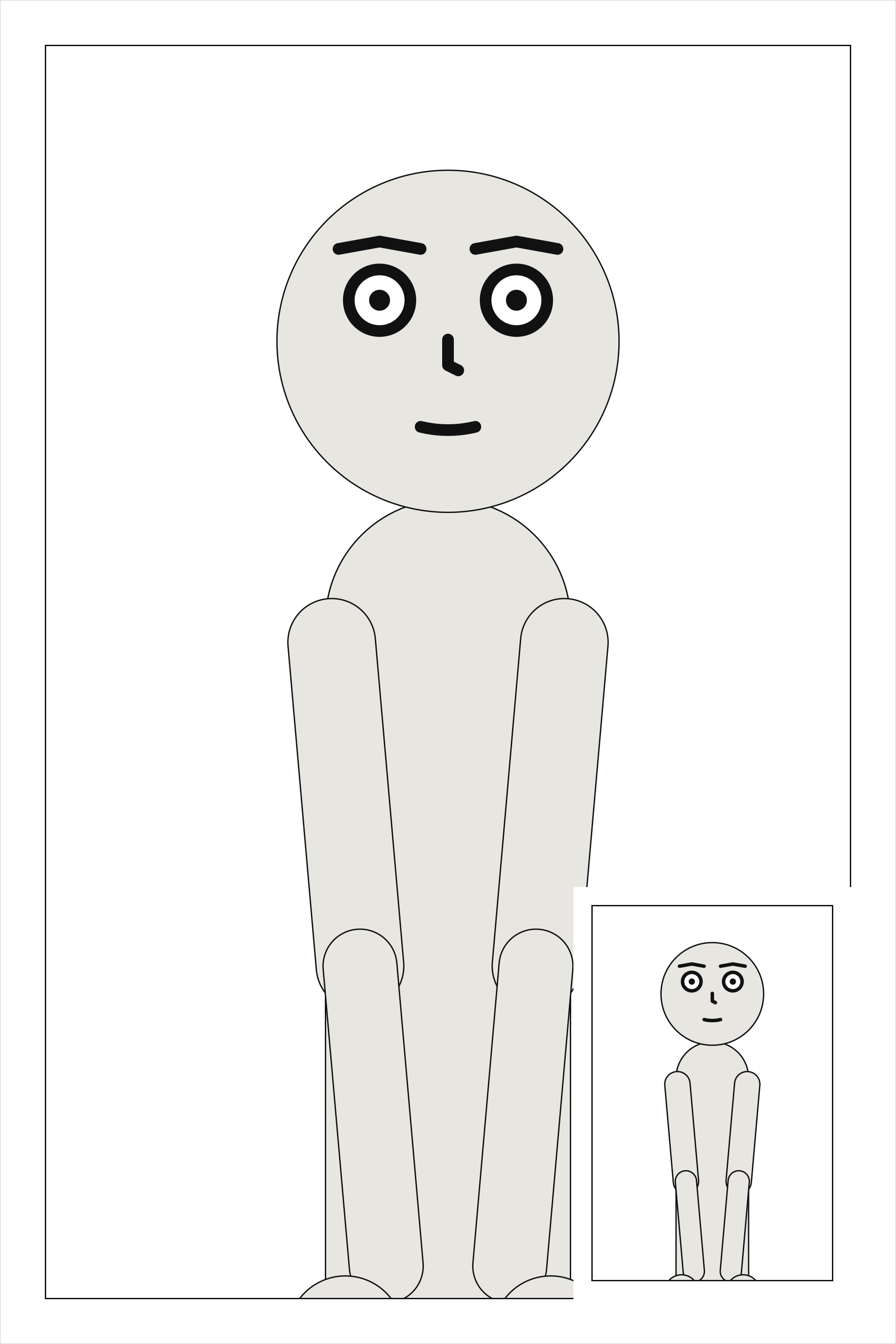
An inset is a small panel set into a corner of another and drawn over it. It sits a gutter in from both edges of its corner, ringed by a gutter’s width of white. The parent is cut around each inset’s ring rather than painted under it, so an inset read first is still on top. The parent’s art is drawn exactly as if the inset were not there; only its lettering moves, since words under an inset could not be read. When an inset covers a character’s face, the compiler notes it.
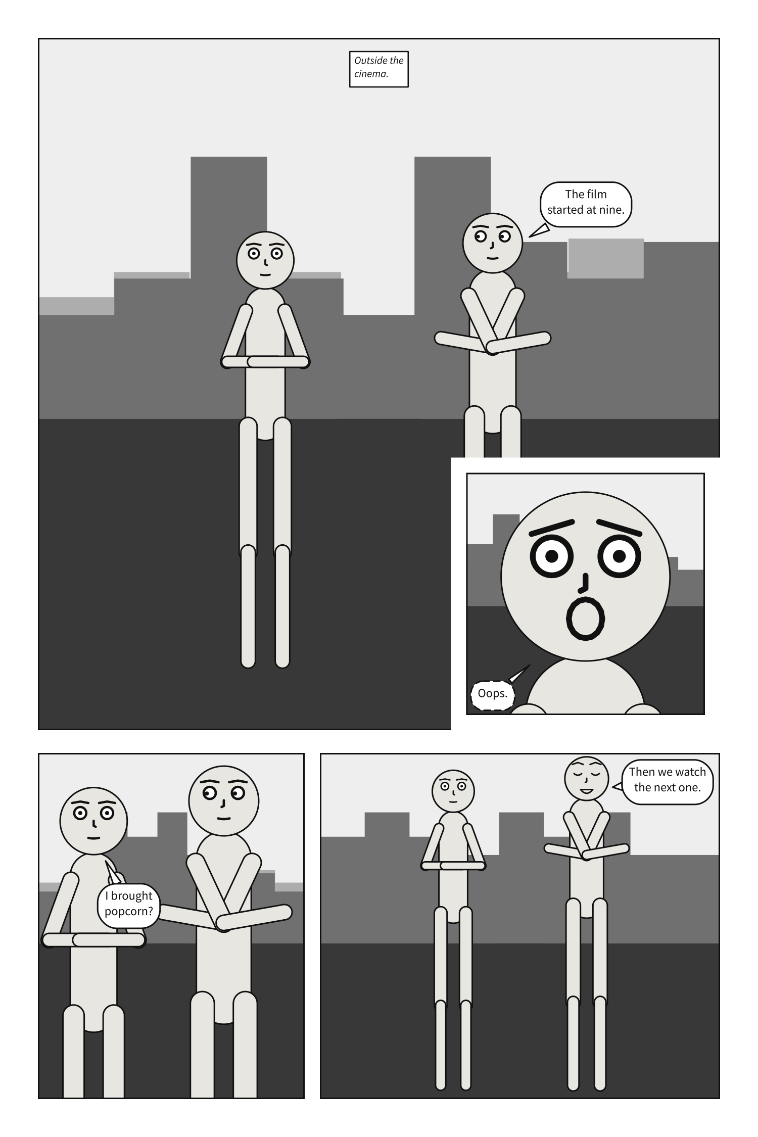
Two insets in one panel must stay a gutter clear of each other, and an inset, a gutter in from its
corner, must fit inside its panel; either is page-layout otherwise.
cast: {alice: {reference: alice}}
panels: {street: {}, clock: {}}
pages:
  - tiers:
      - panels:
          - use: street
            insets:
              - {use: clock, at: top_left, size: 0.3}
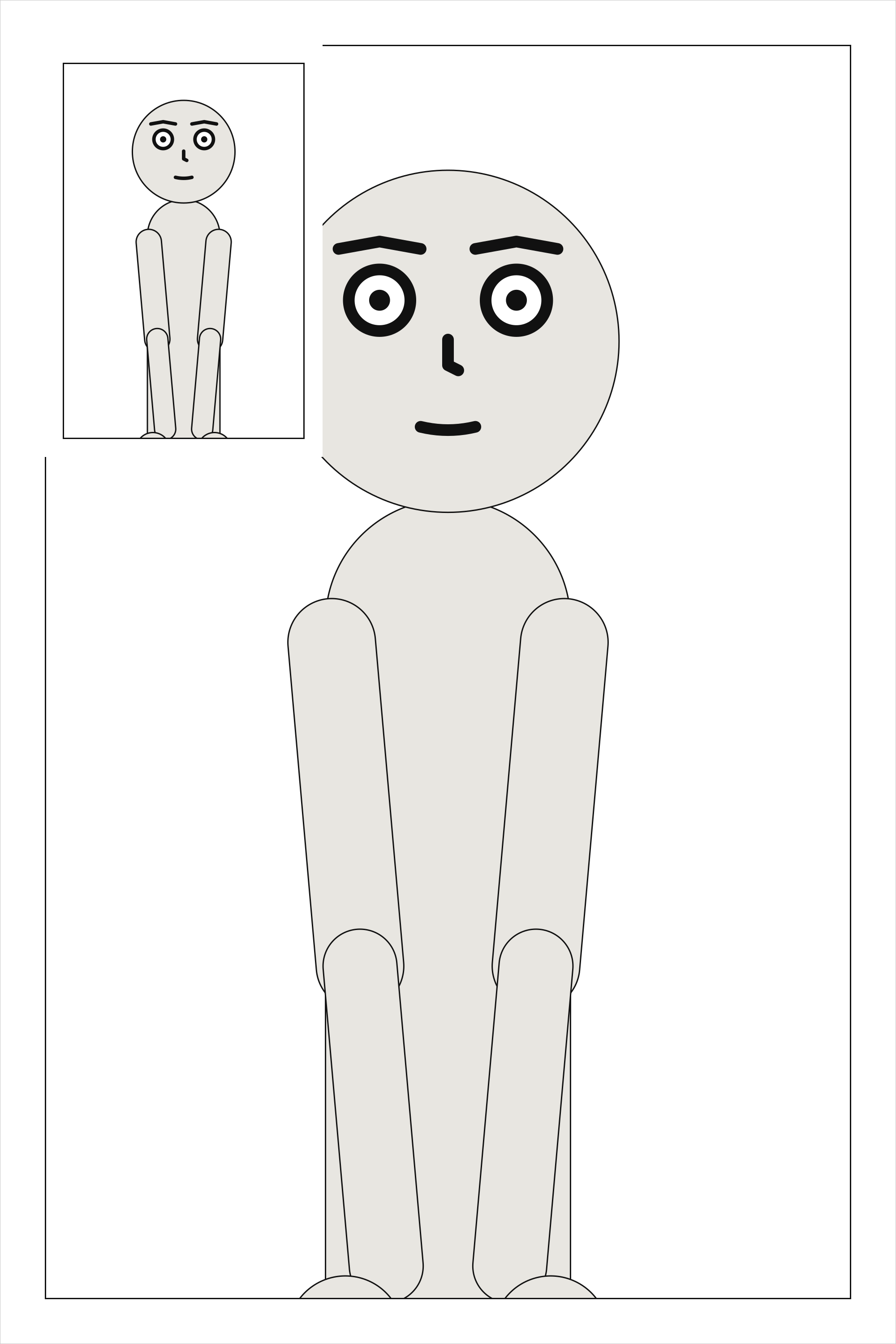
See also: insets[].read.
columns[].width#
The column’s share of its tier’s width, relative to the other columns.
Where |
A |
Type |
a number |
Values |
above 0 |
Default |
|
Since |
0.10 |
Diagnostics |
A column’s share of its tier’s width, relative to the other columns, as a panel’s width is in a
tier of panels.
cast: {alice: {reference: alice}}
panels: {above: {}, below: {}, falling: {}}
pages:
  - tiers:
      - columns:
          - {width: 2, panels: [above, below]}
          - {width: 1, panels: [falling]}
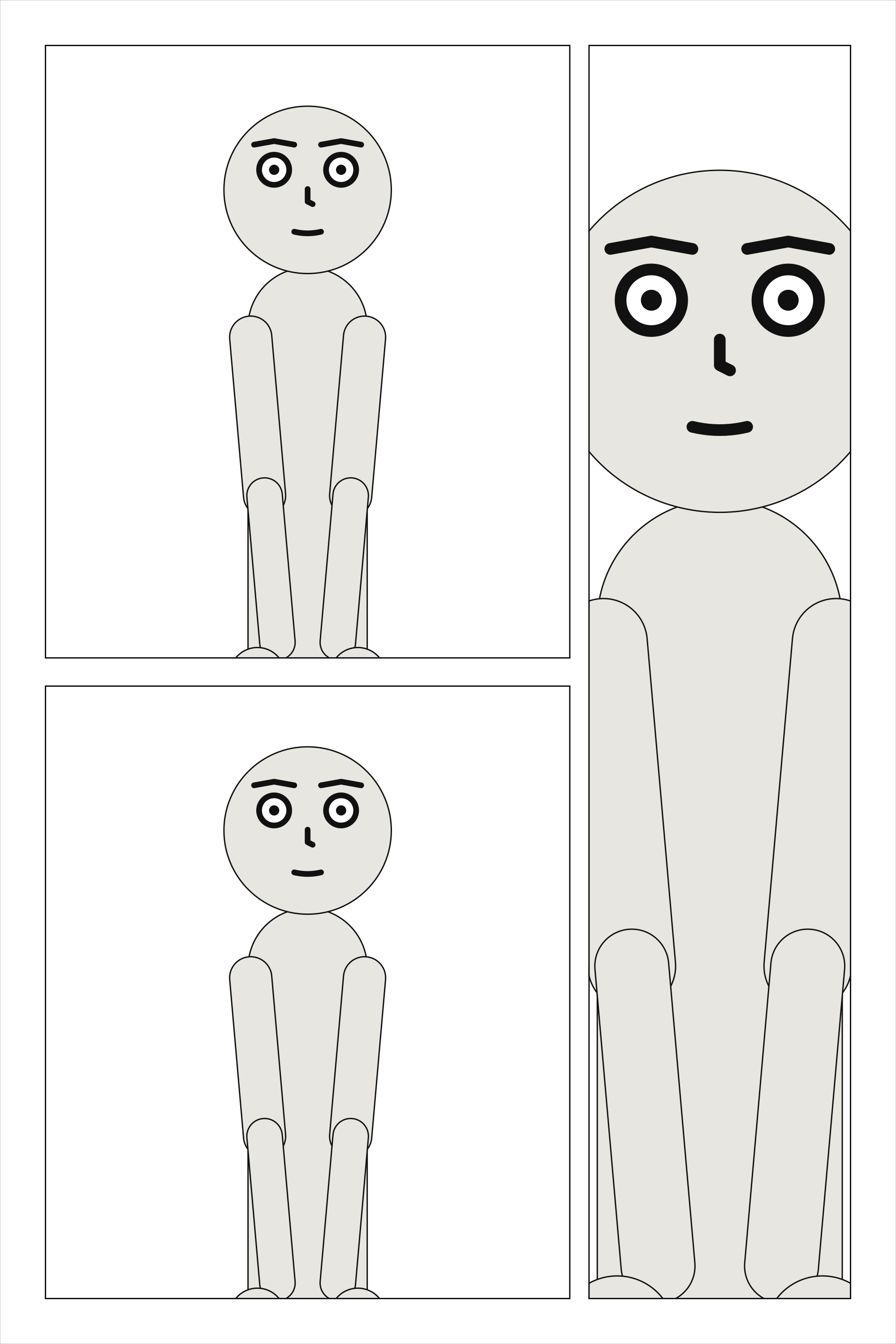
See also: tiers[].columns.
columns[].panels#
The panels in the column, read top to bottom.
Where |
A |
Type |
a list, each text or a mapping |
Default |
none |
Since |
0.10 |
Diagnostics |
The panels of a column, read top to bottom, each a name or a mapping, as a tier’s panels are; a column holds at least one.
cast: {alice: {reference: alice}}
panels: {above: {}, below: {}, falling: {}}
pages:
  - tiers:
      - columns:
          - {panels: [above, {use: below}]}
          - {panels: [falling]}
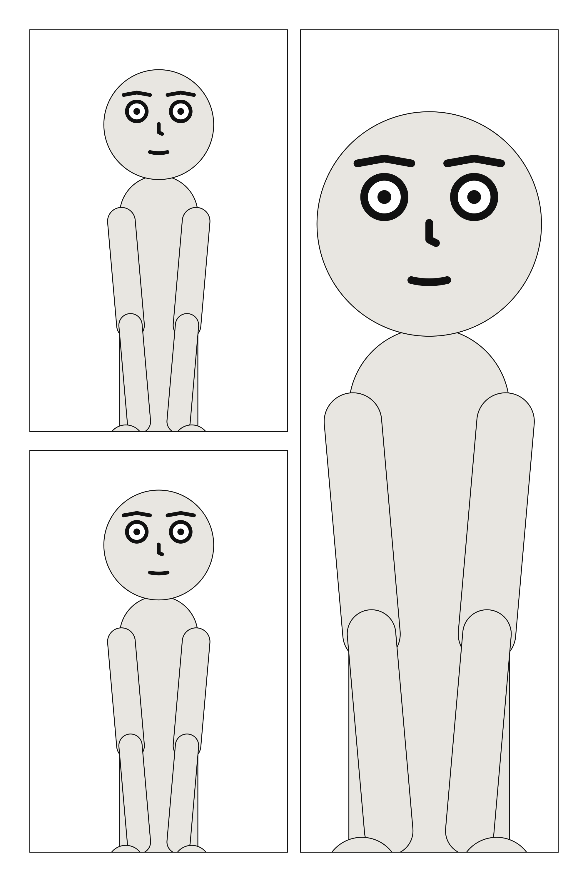
See also: columns[].panels[].height.
columns[].panels[].height#
The panel’s share of its column’s height, relative to the others in it.
Where |
A |
Type |
a number |
Values |
above 0 |
Default |
|
Since |
0.10 |
Diagnostics |
A panel’s share of its column’s height, relative to the others in it.
cast: {alice: {reference: alice}}
panels: {above: {}, below: {}, falling: {}}
pages:
  - tiers:
      - columns:
          - {panels: [above, {use: below, height: 2}]}
          - {panels: [falling]}
See also: tiers[].height.
insets[].use#
The name of a panel under panels:, set into this one.
Where |
A |
Type |
text |
Default |
none |
Since |
0.10 |
Diagnostics |
The panel set into the corner, by its name under panels:. Like any panel on a page, it is placed
once.
cast: {alice: {reference: alice}}
panels: {street: {}, face: {}}
pages:
  - tiers:
      - panels: [{use: street, insets: [{use: face, at: bottom_right, size: 0.3}]}]
See also: panels[].insets.
insets[].at#
The corner of its parent the inset sits in, a gutter in from both edges.
Where |
A |
Type |
a name |
Values |
|
Default |
none |
Since |
0.10 |
Diagnostics |
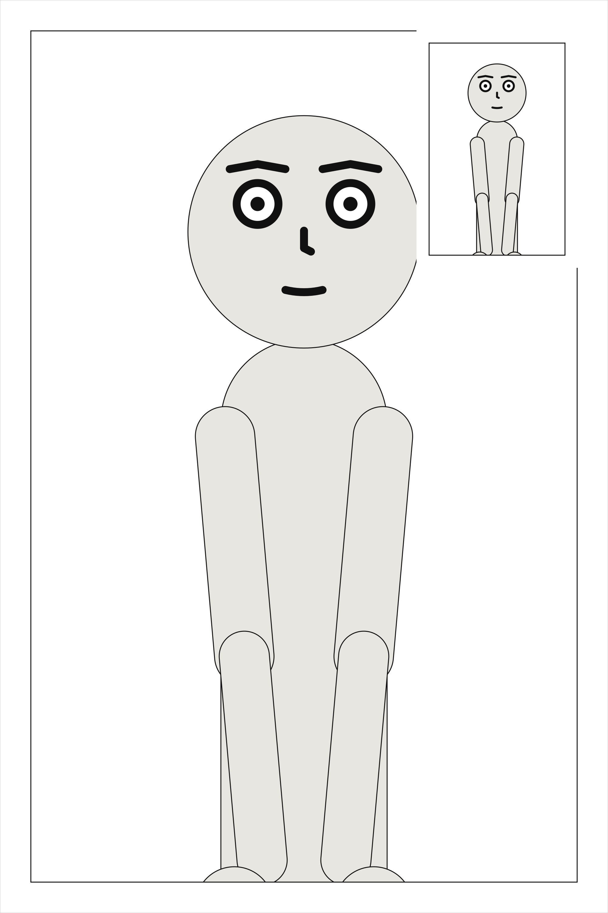
The corner of its parent. The corner is the parent’s whichever way the page is read: an inset’s
at is never mirrored.
cast: {alice: {reference: alice}}
panels: {street: {}, clock: {}}
pages:
  - tiers:
      - panels: [{use: street, insets: [{use: clock, at: top_right, size: 0.25}]}]
See also: insets[].size.
insets[].size#
The inset’s width and height, as a fraction of its parent’s: above 0, at most 0.5.
Where |
A |
Type |
a number |
Values |
above 0, at most 0.5 |
Default |
none |
Since |
0.10 |
Diagnostics |
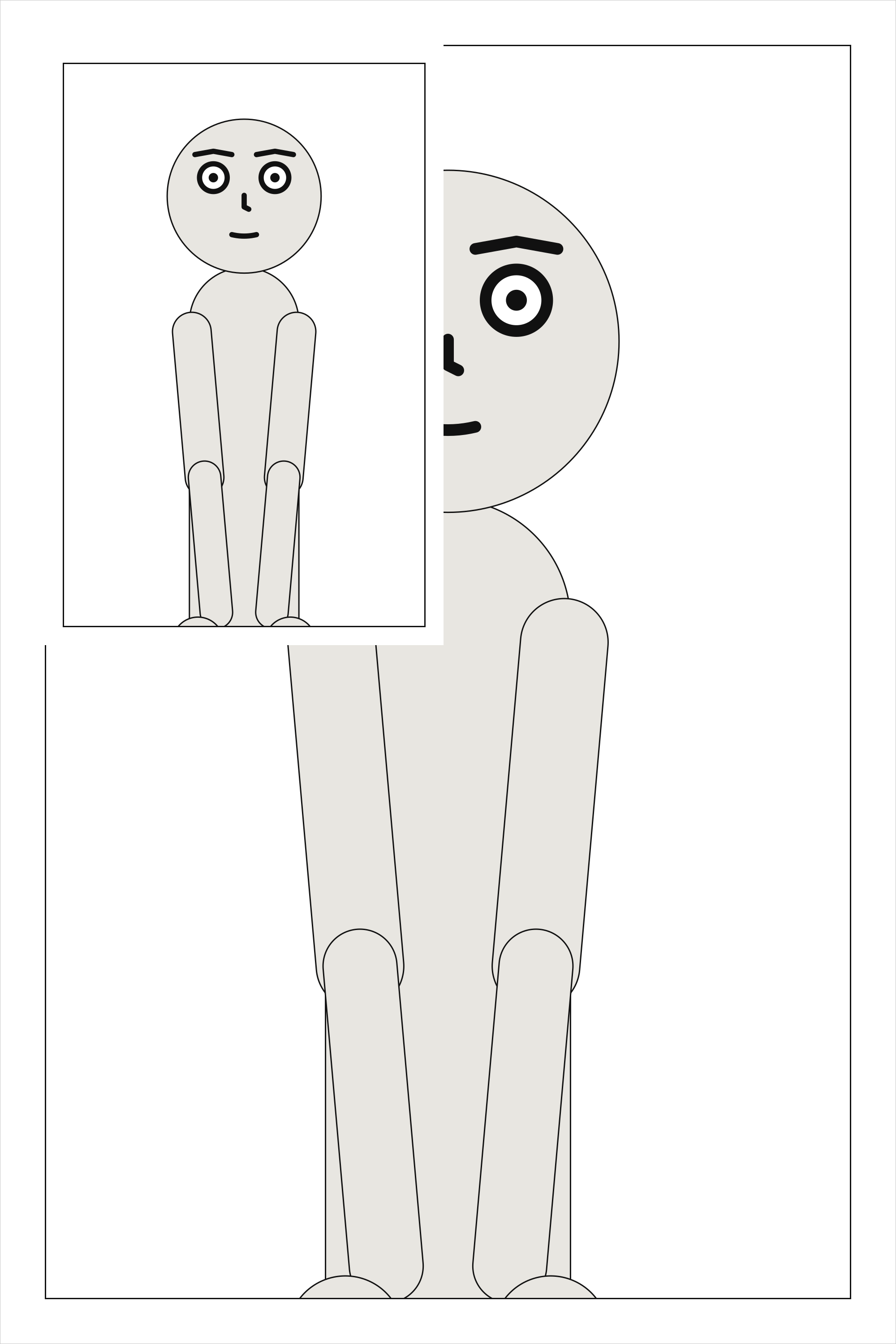
The inset’s width and height, as one fraction of its parent’s: 0.25 is a quarter as wide and a
quarter as tall. More than half would leave the parent covered rather than inset.
cast: {alice: {reference: alice}}
panels: {street: {}, clock: {}}
pages:
  - tiers:
      - panels: [{use: street, insets: [{use: clock, at: top_left, size: 0.45}]}]
See also: insets[].at.
insets[].read#
When the inset is read: after its parent, or before it.
Where |
A |
Type |
a name |
Values |
|
Default |
|
Since |
0.10 |
Diagnostics |
Readers split about evenly over whether an inset comes before the panel it sits in or after it
(Cohn, 2013), so it is never guessed: an inset is read right after its parent unless it says
read: before. That is the order the page’s SVG writes them in, which is the order a screen reader
follows.
cast: {alice: {reference: alice}}
panels: {street: {}, clock: {}}
pages:
  - tiers:
      - panels: [{use: street, insets: [{use: clock, at: top_left, size: 0.25, read: before}]}]
See also: the reading order of a page, pages.
Read right to left#
With direction: rtl, the same page is read from the top right. Panels
are still written in reading order, so the first panel of a tier is at its right and the last at its
left; the first column of a tier of columns is at the right, and each column is still read top to
bottom – a stack beside a tall panel is read down before across, on the right. Each frame is
exactly the one a left-to-right page gives that panel with the tier written the other way round, so
every panel keeps its size, and its art is the art it has read left to right. What names a place on
the page keeps naming it: an inset’s at: is a corner of its parent, a positive slant leans the
top of each gutter right, as written, and a bleed names the page’s own sides, so bleed: [left]
on a tier’s first panel, which right to left is at the right, is refused. Any other layout one
direction refuses, the other refuses too.