lettering#
How the lettering is set: the dialogue type size, and the font files.
Where |
A |
Type |
a mapping |
Default |
each key’s own |
Since |
0.11 |
Diagnostics |
How the lettering is set: its size, and the face it is set in. Both are the author’s to choose, and the compiler measures every line against exactly what was chosen, because a balloon’s size decides where it can go.
Set beside panels:, lettering is a default every panel inherits, which is how a whole page
letters at one size you chose. Set on one panel, it letters that panel alone. In a comic script,
put it in the front matter for every panel, or in an @lettering: directive for one.
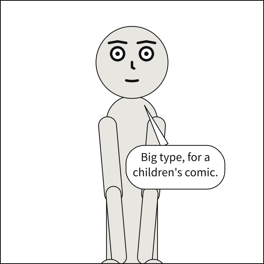
lettering: {size: 46}
cast: {alice: {reference: alice}}
script:
  - say: {by: alice, text: "Big type, for a children's comic."}
See also: say.text, which line breaking is measured for;
Letter in your own font.
lettering.size#
The dialogue type size, in panel units; captions keep 30 parts in 35 of it. Left out, 3.5% of the height the panel letters against: its own, or one tier of a three-tier page.
Where |
A |
Type |
a number |
Values |
above 0 |
Default |
none |
Since |
0.11 |
Diagnostics |
|
In the gallery |
Left out, dialogue is lettered at 3.5% of the height the panel letters against and captions at 3% – the panel’s own height when it stands alone, and one tier of a three-tier page when it is on a page, so that no letterer’s short panel and tall panel are set at two sizes. That is a good default and a bad only choice: a page of tight panels wants smaller type, a children’s comic larger, and neither is something the compiler should guess.
size is in the units of panel.size, which on a page are the page’s, since a panel there is
compiled at its frame’s size. Captions keep their proportion to it, 30 parts in 35; a line
written size: small and a sound effect are measured from it too.
The type is measured at exactly this size, so it decides how big every balloon is. A size too
large for the panel leaves a balloon nowhere to go, which scenet check --deep reports as
balloon-placement.
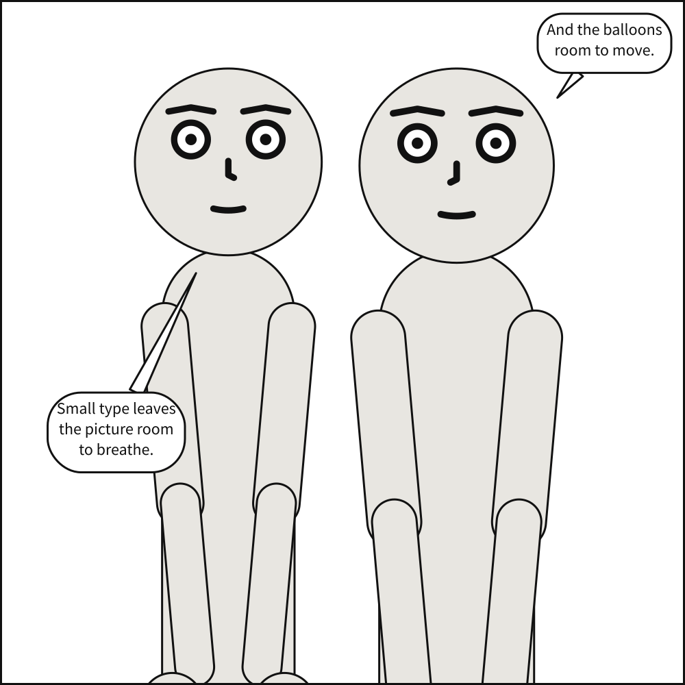
lettering: {size: 24}
cast:
  alice: {reference: alice, at: left_third}
  bob: {reference: bob, at: right_third, facing: left}
script:
  - say: {by: alice, text: "Small type leaves the picture room to breathe."}
  - say: {by: bob, text: "And the balloons room to move."}
lettering.font#
The font files to letter in, relative to the document: one file for every face, or one for each. Left out, Source Sans Pro.
Where |
A |
Type |
text, or a mapping |
Default |
none |
Since |
0.11 |
Diagnostics |
|
In the gallery |
Scenet letters in Source Sans Pro unless you name a face of your own. A font is always a file
you name, never a font installed on the machine: what is measured has to be the same
everywhere, or the same document would letter differently on two computers. Write one file for
every face, font: fonts/Comic-Regular.ttf, or a mapping with a file for each.
Paths are relative to the document, the way a link in a web page is:
fonts/x.ttfis thefontsfolder beside the file, whereverscenetwas run from, and../fonts/x.ttfclimbs out of it. An absolute path is refused, so a document and its fonts move together, and a server compiling documents it is sent cannot be pointed at its own files. Folders are separated by/, never\, which only Windows reads as a separator: a backslash is refused, so a document finds its files on every system or on none. Text compiled with no file behind it – by the MCP server, say – has no folder, so it can name a font only when its caller says which folder it belongs to, or sends the file with it.TrueType or OpenType, with a Unicode character map, since every line is measured against it – kerning included. A path that is absolute, missing, or not such a font is reported as
font-file, at the face that names it.A face you do not name stands in from one you do, and the compiler says so when a stand-in is used; see each face’s card below. A family from one file stays one family, rather than mixing your face with the shipped one.
Panel Core records each face by its family, style and a digest of its bytes, never by where the
file was; see Panel Core. Rendering needs the same files, and refuses a panel
whose fonts it was not given rather than draw its lettering in a face it was not measured in.
scenet build and the playground hand them over for you. --live-text names your font’s family.
The faces letterers use are mostly commercial, or free only on their own terms. You can name one;
Scenet can only ship a face whose licence allows it, which is why Source Sans Pro, under the SIL
Open Font License, is the default. In the
playground, Font… adds a file to the
document’s fonts/ folder for as long as the tab is open.
lettering: {font: fonts/ComicNeue-Regular.ttf}
cast: {alice: {reference: alice}}
script:
  - say: {by: alice, text: "One file, every face."}
See also: Letter in your own font.
lettering.font.regular#
The font file dialogue and spoken captions are lettered in, relative to the document. Written alone, as font: fonts/Comic.ttf, it letters every face.
Where |
A |
Type |
text |
Default |
none: required |
Since |
0.11 |
Diagnostics |
The face italic and bold italic stand in from, when they are not named. It is the only face a
mapping must name, and writing font: as one path is writing this one.
lettering:
  font: {regular: fonts/ComicNeue-Regular.ttf}
cast: {alice: {reference: alice}}
script:
  - say: {by: alice, text: "Dialogue in Comic Neue."}
See also: lettering.font.italic.
lettering.font.italic#
The font file every caption but a spoken one is lettered in. Left out, they are set in regular.
Where |
A |
Type |
text |
Default |
none |
Since |
0.11 |
Diagnostics |
Italic is what locale, monologue and editorial captions are set in, and what emphasis falls
back to when there is no bold italic. A real italic file, never a slant applied to the roman: a
synthetic slant would be measured as the roman and drawn as neither.
lettering:
  font: {regular: fonts/ComicNeue-Regular.ttf, italic: fonts/ComicNeue-Italic.ttf}
cast: {alice: {reference: alice}}
script:
  - caption: {text: "Later. The same corner."}
See also: caption.kind, which decides which captions are italic.
lettering.font.bold_italic#
The font file a stressed word, _word_, is lettered in. Left out, it is italic, or regular when there is no italic, and a note says so.
Where |
A |
Type |
text |
Default |
none |
Since |
0.11 |
Diagnostics |
A word written between underscores is stressed, and lettered in bold italic, the letterers’ convention for it. The stressed word is measured in this face too, so it widens its balloon by exactly as much as it is drawn wider.
lettering:
  font:
    regular: fonts/ComicNeue-Regular.ttf
    bold_italic: fonts/ComicNeue-BoldItalic.ttf
cast: {alice: {reference: alice}}
script:
  - say: {by: alice, text: "I _told_ you."}
See also: say.text, where emphasis is written.
lettering.font.display#
The font file sound effects are lettered in. Left out, the shipped display face, Bangers, whatever the other faces are.
Where |
A |
Type |
text |
Default |
none |
Since |
0.11 |
Diagnostics |
Sound effects are letters that are part of the picture, so they have a face of their own, and it
does not stand in from regular: left out, effects are lettered in Bangers, which ships with
Scenet, whatever the dialogue is set in.
lettering:
  font: {regular: fonts/ComicNeue-Regular.ttf, display: fonts/ComicNeue-Bold.ttf}
cast: {alice: {reference: alice}}
script:
  - sfx: {text: CLUNK, from: alice}
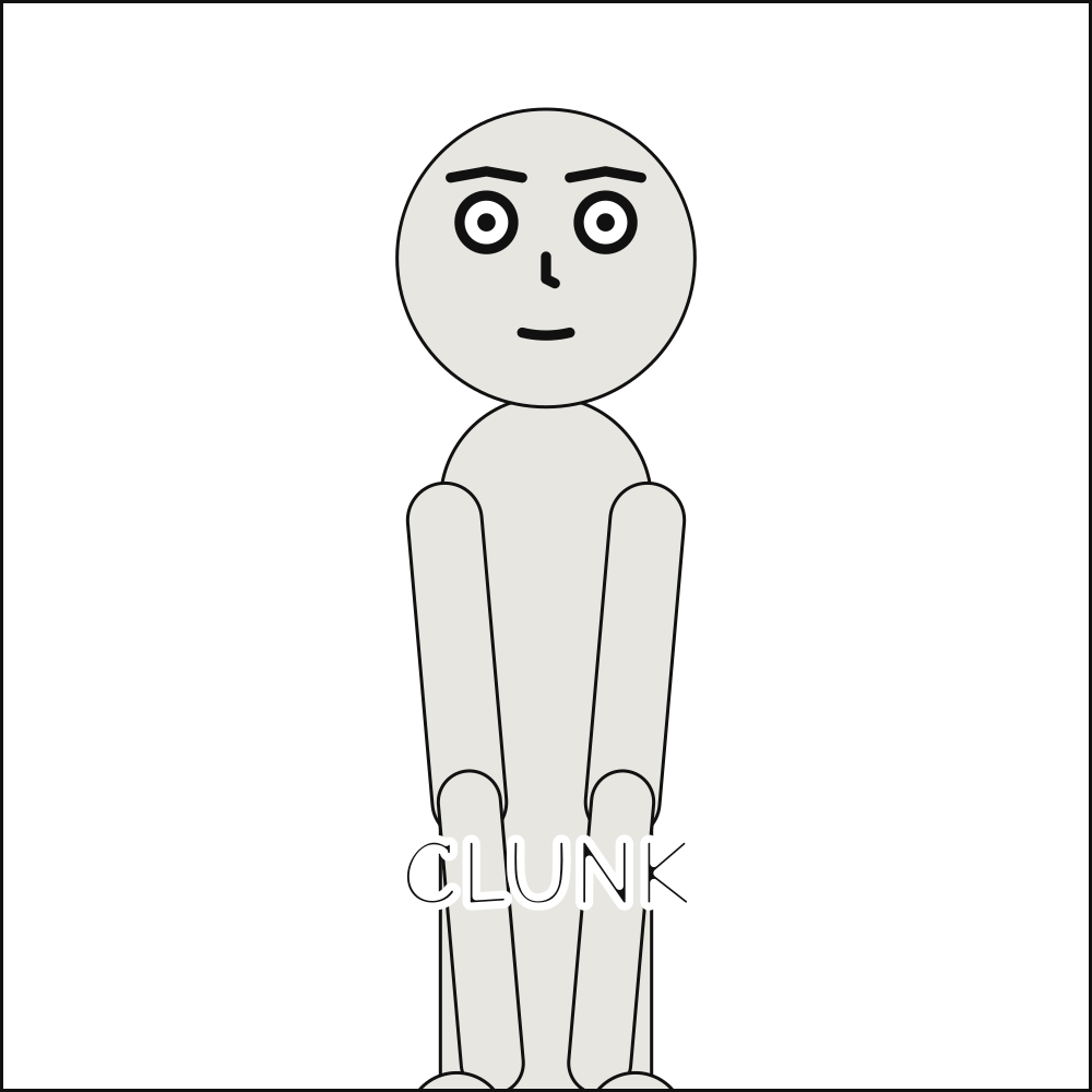
See also: sfx.
Capitals are yours to set#
Comics are conventionally lettered in capitals, and Scenet sets exactly what you type. It does not uppercase for you, because doing it well is not a case conversion: the personal pronoun “I” takes a crossbar that every other capital I does not, and choosing between the two needs a font with both forms and the contextual substitution that picks one, which only a full text shaper performs. Scenet applies no glyph substitution at all, so a face that picks its crossbar “I” contextually will not pick it here either. Write in capitals if you want them.